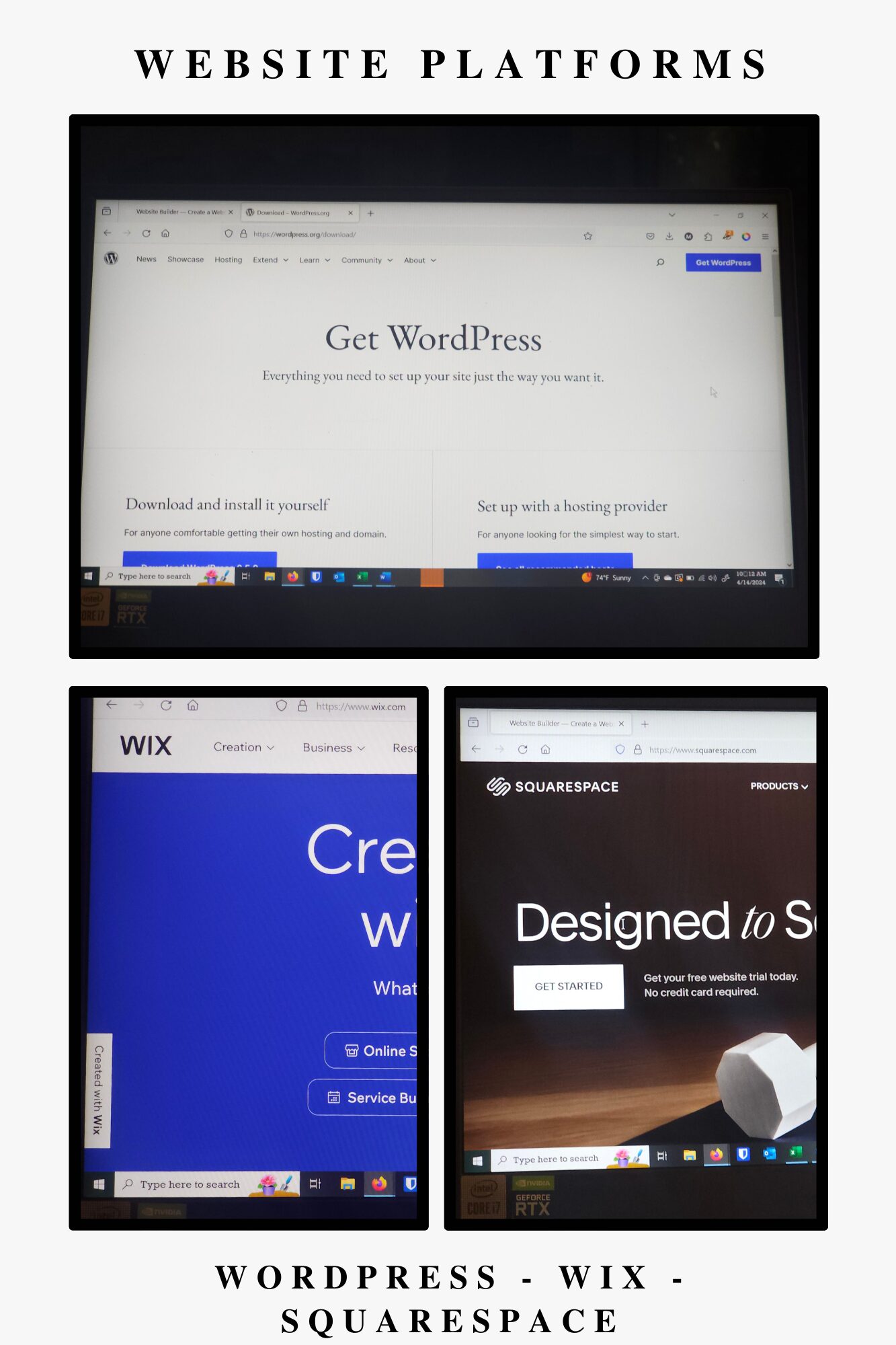
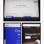
Choosing the Best Website Builder: WordPress, Wix, or Squarespace | Ramp Design Co.
Deciding on the right website builder is crucial for your online success. Compare WordPress, Wix, and Squarespace to determine the best fit for your website’s needs.
Why Every Small, Women-Owned Business Needs a Website | Ramp Design Co.
Learn the essential reasons why every small, women-owned business should have a website. From enhancing credibility to increasing visibility, find out how a website can transform your business.
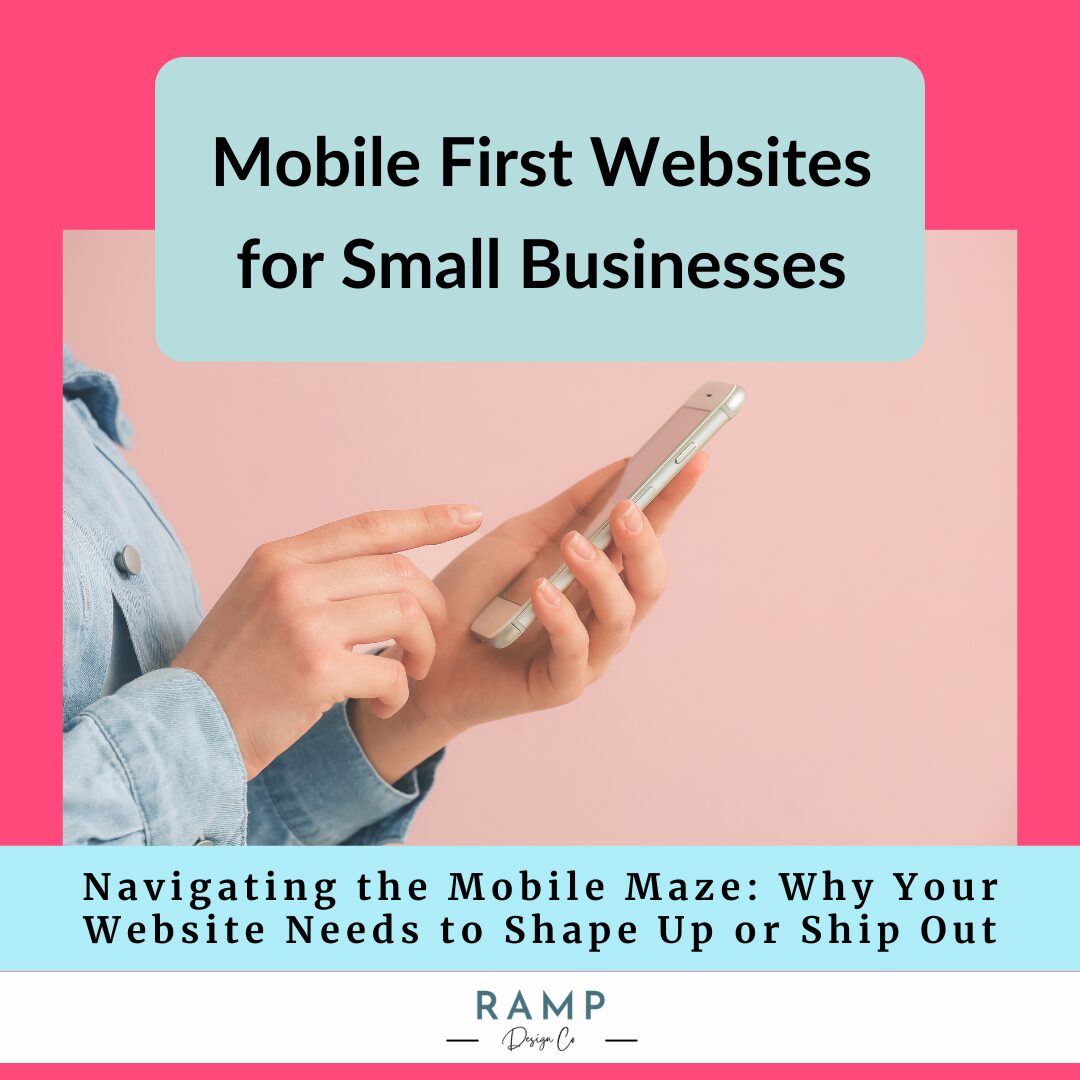
Navigating the Mobile Maze: Why Your Website Needs to Shape Up or Ship Out
Hey there, digital wanderers and web wizards! It’s Mindy from Ramp Design Co., here to spill the tea on something that’s revolutionizing the web: mobile-first design. In our smartphone-clinging world, having a website that’s more maze than magic on mobile devices is a no-go. Mobile-first design is our knight in shining armor, ensuring your site is not just a pretty face on desktops but a dream to navigate on phones too.
Why the fuss about mobile-first? Well, imagine missing out on inviting half your pals to the party of the year—yep, that’s what you’re doing if your site snubs mobile users. With Google cheering on mobile-friendly sites and users craving smooth scrolling experiences, it’s clear: adapting to mobile-first isn’t just nice; it’s necessary.
So, are you ready to make your website the belle of the mobile ball? Let’s dive in and transform your digital space into everyone’s favorite hangout, no matter the screen size!